Upside Talent
Brand strategyVisual identitySales deckMarketing tools
Recruitment for AI, technology, digital and sales teams across Australia. Karl Fagan and ’Cilla Arnold, 35+ years combined experience and thousands of placements behind them.
In short
Nine weeks: strategy, tone of voice, identity refinement, and the applications the team uses daily.
Four years of growth through the founders’ own network, and a brand that couldn’t carry a conversation with a stranger. Three complete worlds presented. The hard part was making them pick one instead of keeping their favourite bits of all three.
The existing logo was refined, not replaced. Karl and ’Cilla now produce their own hiring posts, cards and decks without a designer, and a voice kit means their own writing sounds like them without a copywriter in the loop.
Before
Four years in, almost everything Mayvun Arc had won came through Karl and ’Cilla’s own network. That works until you decide to grow, and they had decided to grow.
The brand wasn’t built for that job. It had been assembled piece by piece over the years, originally by a designer in the UK, and had drifted. Karl and ’Cilla called it “higgledy piggledy”: bits of visual identity collected over time, none quite agreeing with each other. Their LinkedIn profiles didn’t match each other, the company avatar was unreadable at size, and email signatures were all slightly different.
None of that matters when the person on the other end already knows you. All of it matters when they don’t. Cold outreach was going out and coming back at a low hit rate, and every asset attached to it was quietly working against the message.
The harder problem was the category. Recruitment pulls hard toward what Karl and ’Cilla called “transactional and cowboy”, the high-volume, low-trust outreach that fills every candidate’s inbox. Looking more polished would have moved them closer to it, not further away. They were also being mistaken for a smaller operation than they were building, which is a difficult thing to correct with a logo.
What we did
Strategy first, and it stayed unglamorous for longer than most clients enjoy. What Mayvun Arc is for, who they’re actually for, what they’d say and what they’d refuse to say.
That work made a series of small decisions that each closed off an easy option. The purpose draft said brilliant recruitment doesn’t happen “by accident”, and accident was the wrong word, so it became “by chance”. The audience had been defined by company size, which meant turning away anyone who didn’t fit a band, so it was redefined by the teams they actually recruit for. The geography said East Coast, which made them sound smaller than they are, so it became Australia. There was a neat acronym available in ARC and we didn’t use it, because forcing the language to fit a device would have cost more than the device was worth.
None of that is visible in the final brand. All of it is why the final brand holds.
Then three complete worlds, each one a full atmosphere rather than a logo: colour, type, imagery, the lot. Light Conditions was prismatic and cool. Human Touch was warm and hand-drawn. The Gap was restrained, all grid and whitespace.
And this is where it nearly came apart. They loved it. They loved bits of all three, and what they wanted was to keep their favourite pieces from each one. That’s the most understandable instinct in this work and it produces a Frankenstein every time. So the brief back was blunt: choose a world, not images. Sit with one and let the others go.
They chose. And because the choice was a whole world rather than a mark, everything after it had somewhere to be measured against.
Before
After
Identity
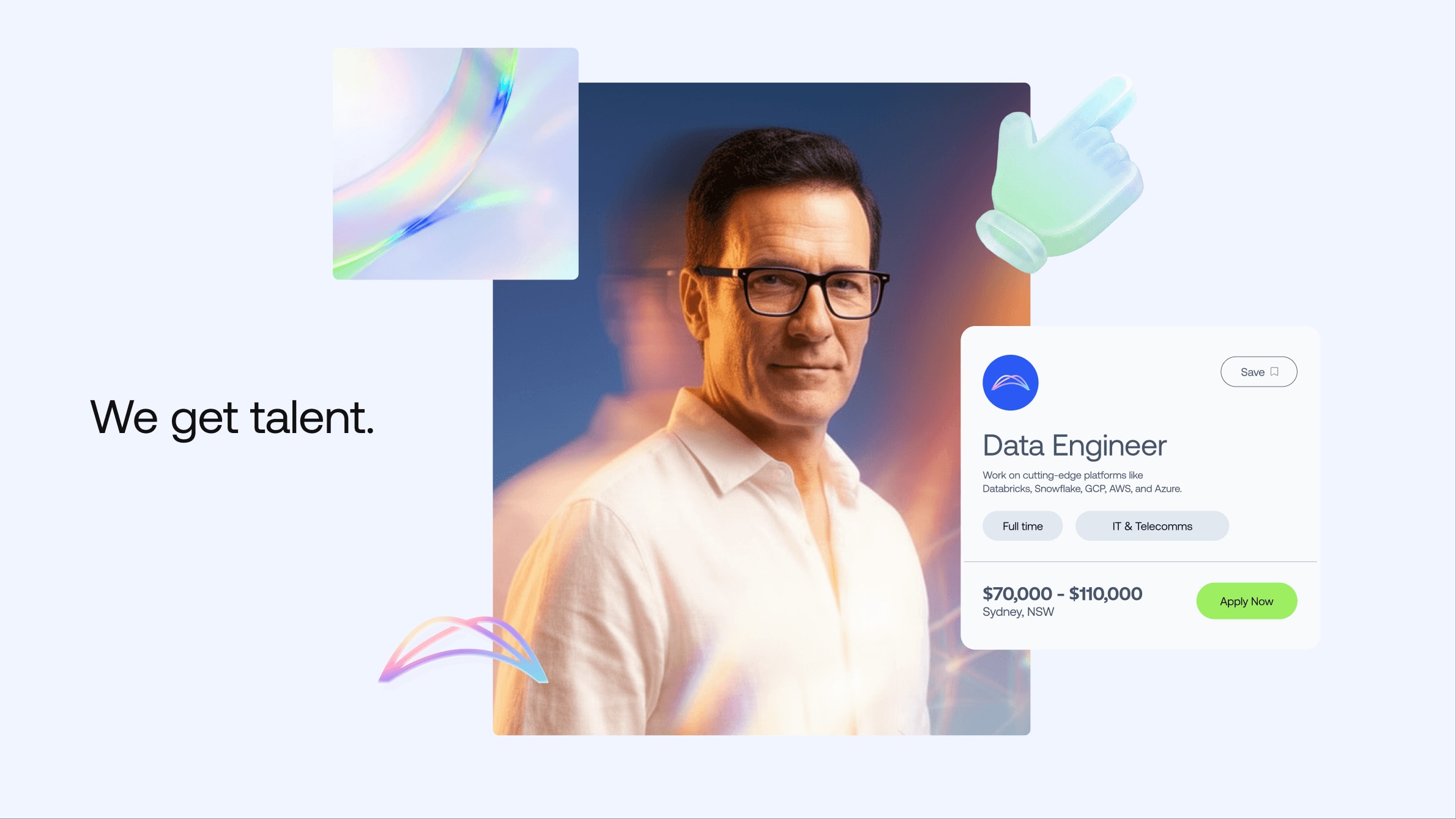
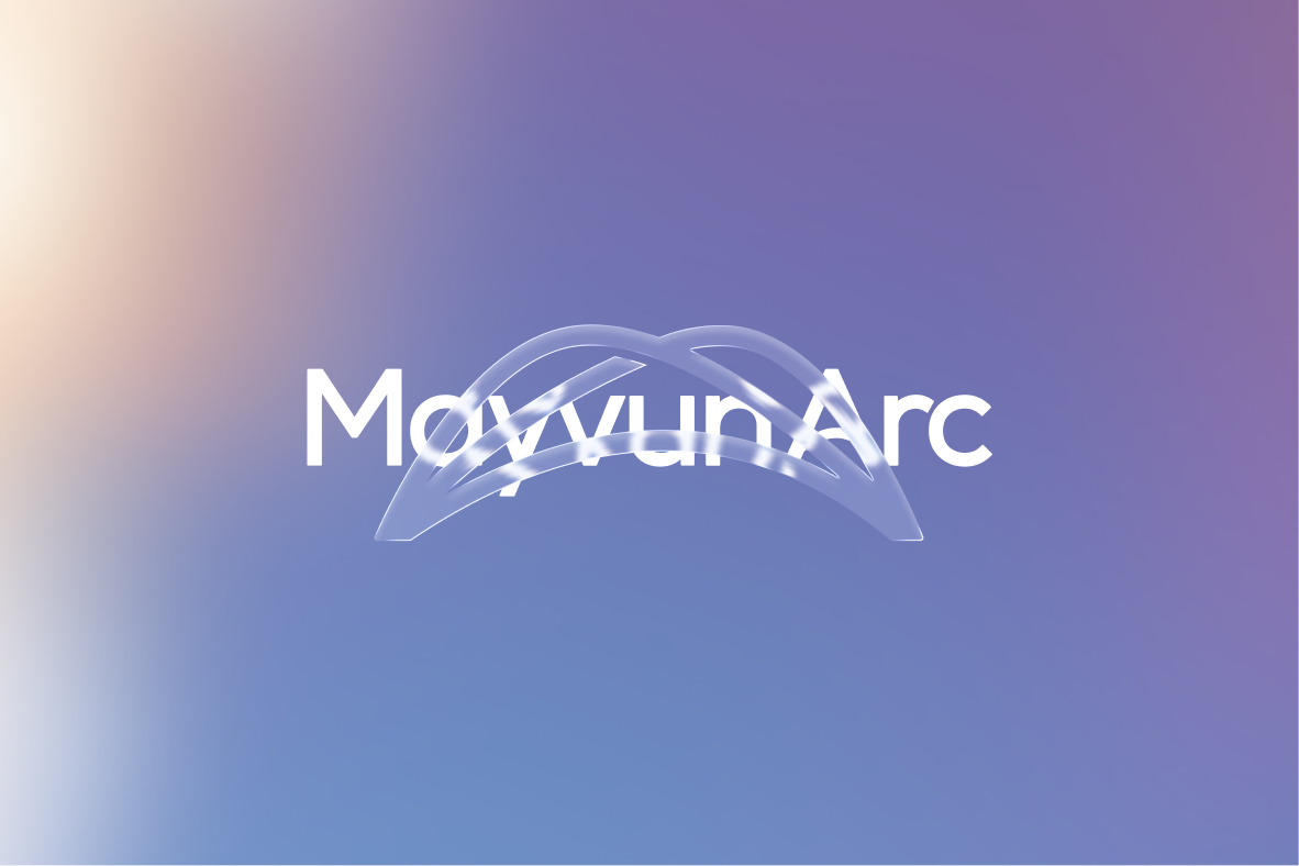
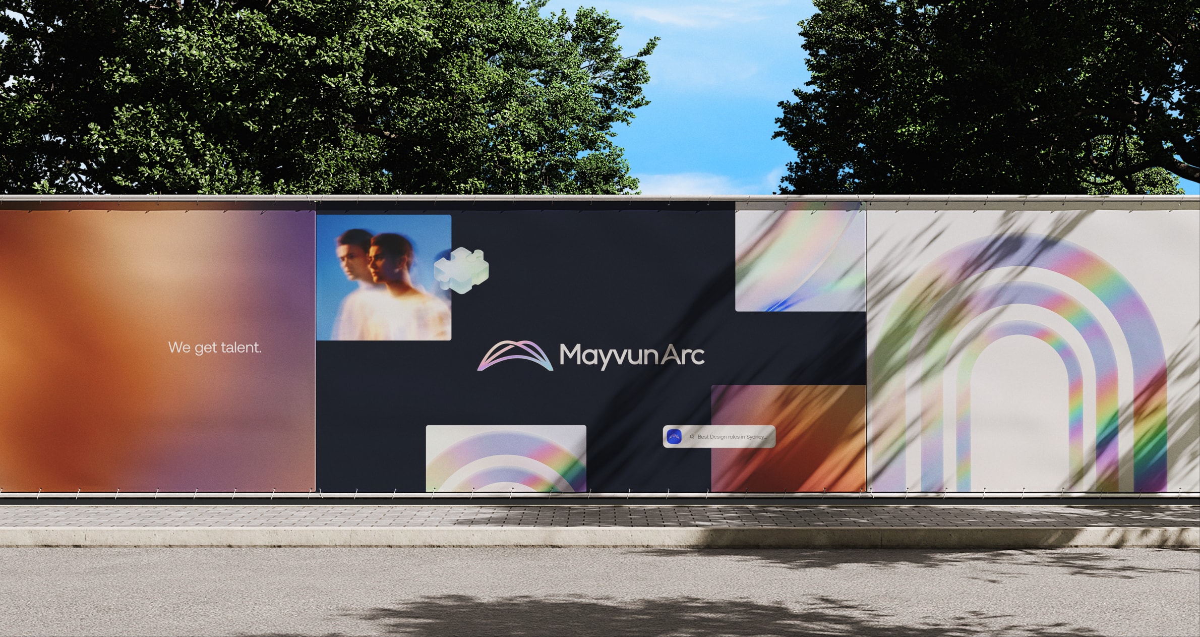
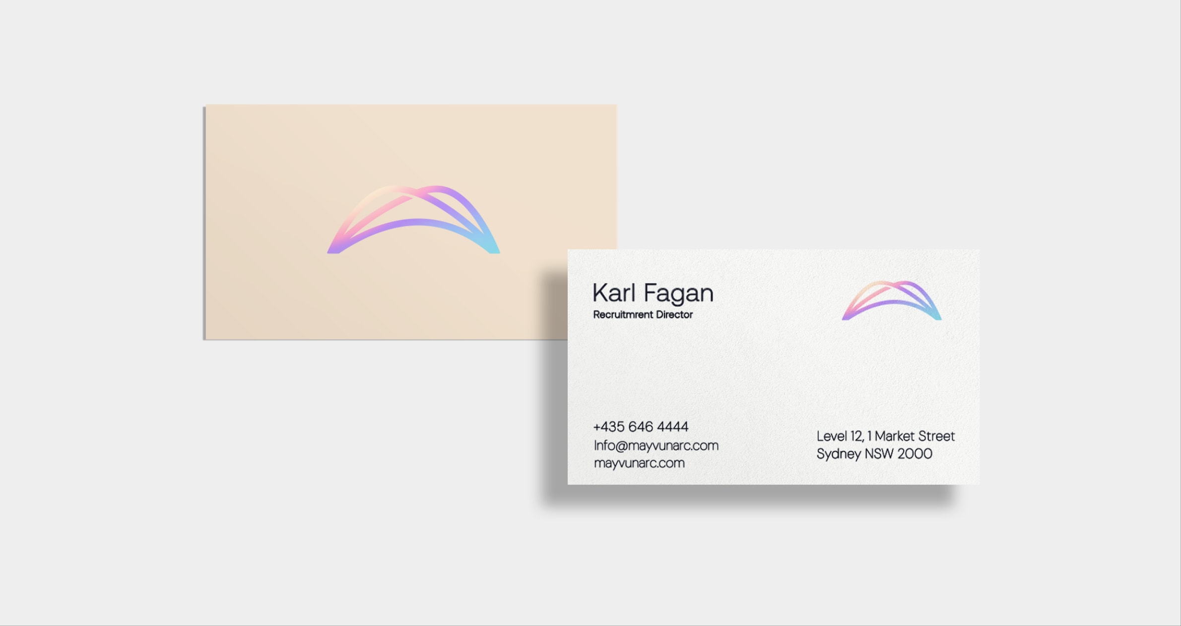
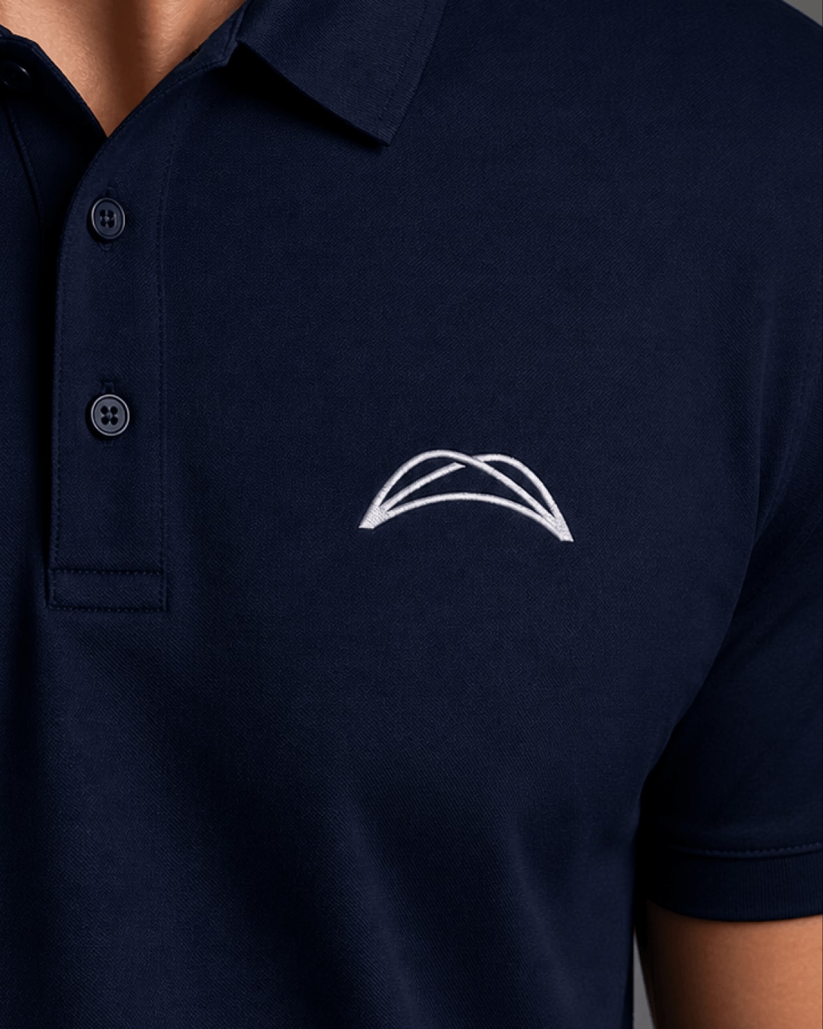
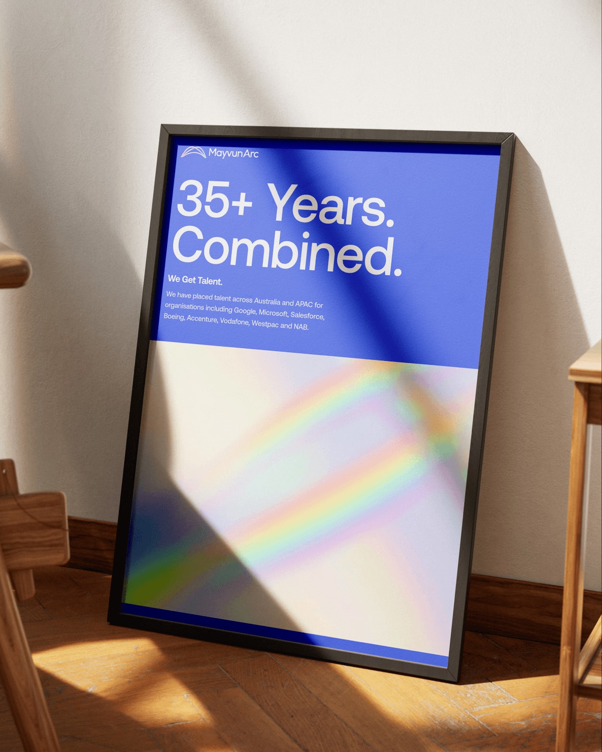
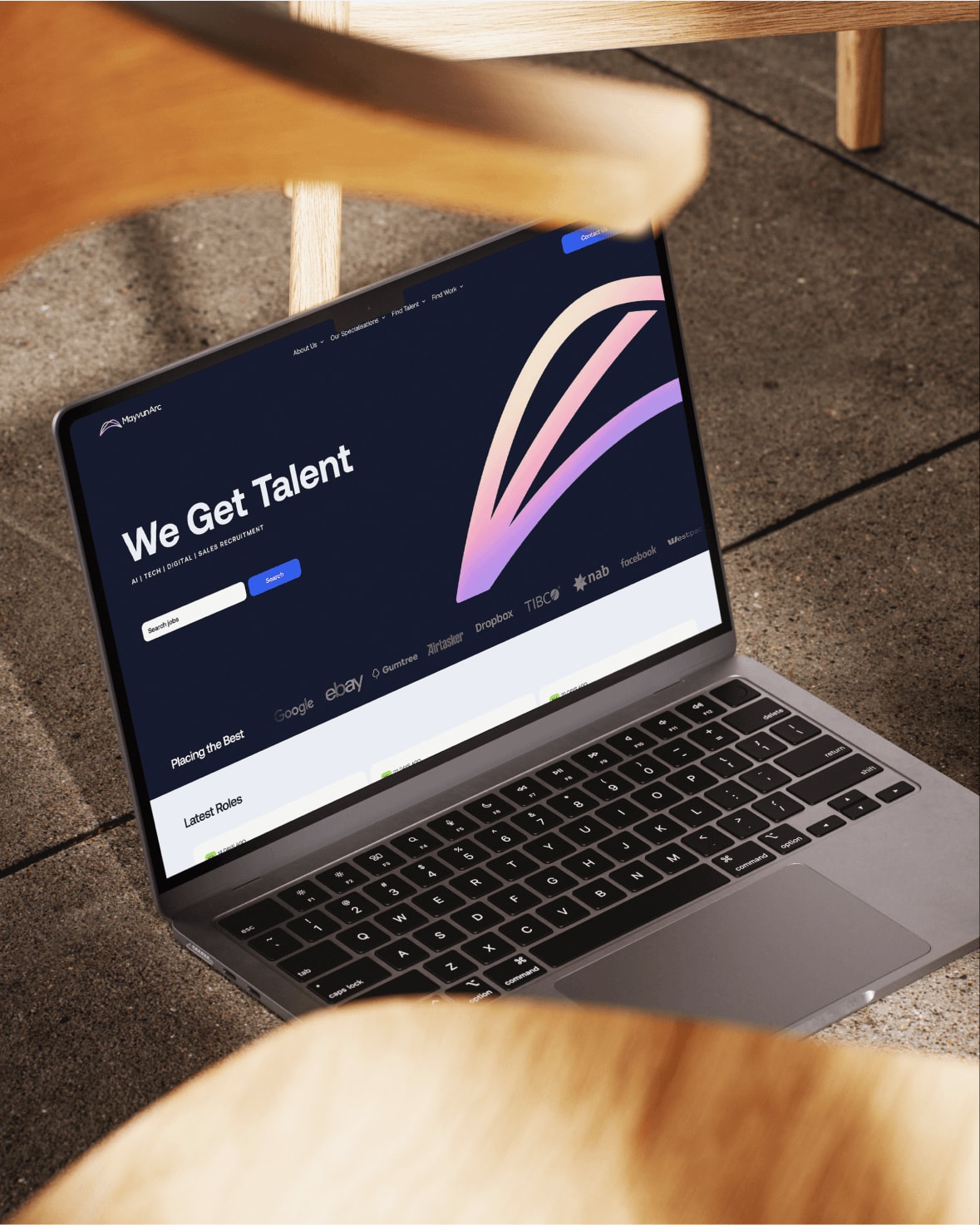
The logo got refined rather than replaced, which meant the recognition they’d already earned stayed with them. The arc became the signature, with one rule holding it together: the rainbow spectrum belongs to the arc and nowhere else. That single constraint turned a palette nobody could recall into something recognisable at a glance.
Tone of voice split by audience. Direct with clients, who need challenging on briefs that won’t produce a good hire. Warm with candidates, who get enough transactional outreach already.
Handover
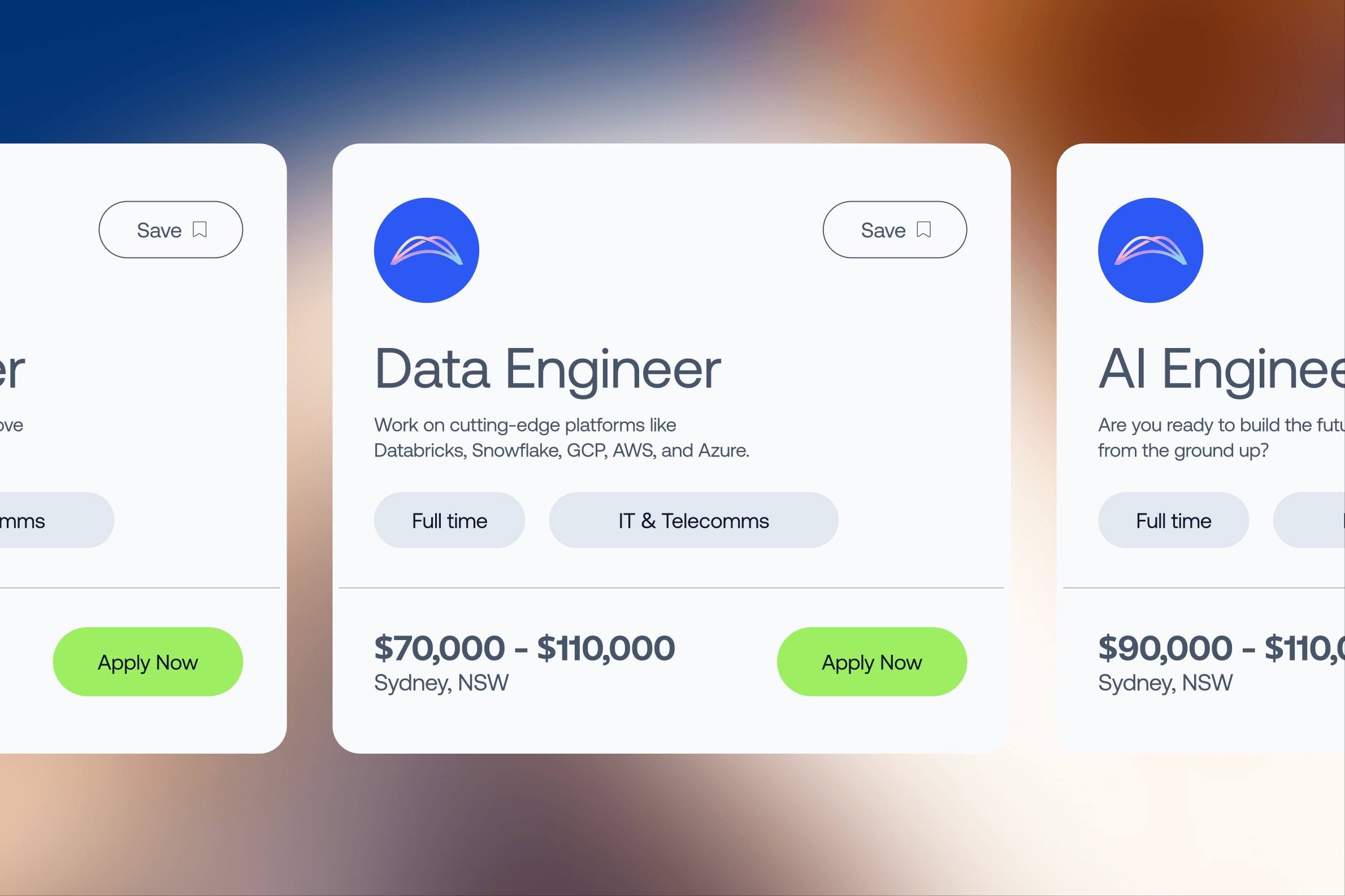
The brand kit lives at a single URL they can send to anyone. The applications sit in Canva so the team edits and reuses them without coming back to us. And because Karl and ’Cilla write a lot of their own material, we packaged the whole voice into a kit they can hand to an AI tool and get drafts that sound like them, without a copywriter in the loop.
Launch
“Feedback out in the wild has been amazing”
Karl’s summary, six weeks after handover.
Their own posts, cards and decks
The team produces its own hiring posts, cards and decks. The voice kit means their writing stays theirs even when a machine drafts it.
Willing to be seen
They came into this having grown quietly on relationships for four years, and came out of it re-energised about the business.
The right order of things
Mayvun Arc can now approach someone who has never heard of them and look like the firm they actually are. That’s the whole point of the exercise. The network they built over four years still works, and it is no longer the only thing that does.
The system is built to stretch. New hires arrive into a brand that already exists rather than one held in the founders’ heads, and the applications don’t queue behind a designer. What they had before was a set of files that had drifted apart. What they have now is a brand that behaves like one thing, which is the only way anyone believes you’re serious.
“From the get-go he made it his mission to understand us, our company, and our brief. We have enjoyed every interaction with him… To say we are happy with the result is an understatement. We constantly get comments and positive feedback on our new logo and brand design, and we feel it truly represents us and our business. Can highly recommend Johan and Tension Studio, a 10/10 experience.”